

my 33 day challenge:
- what:
- 4 x thumbnails (left), 1 bigger sketch (right)
- can use a reference photo (prefer to use my own life experiences, but random references are okay too)
- no Instagram, only telling art friends and sharing here
- why:
- to confidently capture the magic and feeling of the places I love, for the rest of my life (This is a skill I’ve pined for and admire in others’ work)
- to loosen up my shapes and be expressive in a subject matter in which I tend to tighten up
- to develop and strengthen my ability to
- be expressive without making a mess
- render people and places
- interpret and simplify detailed settings
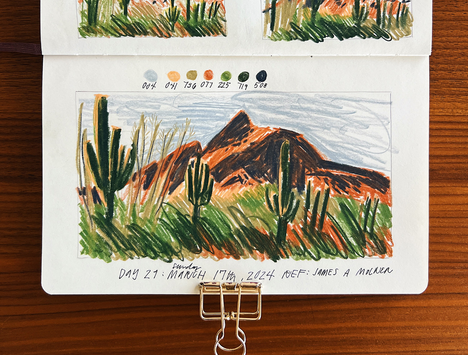
Day 29: Sunday, March 17th, 2024: Cacti in the foreground
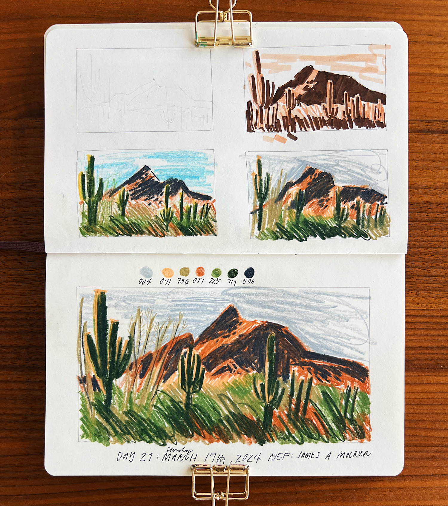
My takeaways from day 29 are:
- drawn from reference by James A Molner (I think I’ve been to this spot)
- I feel torn between using brighter sky colors and drab sky colors. The bright colors do add a liveliness, but the drab colors feel grounding and very comforting to me. In this piece drab won
- in the thumbnails I tested a yellow highlight vs warmer yellow/orange highlight – the orange surprised me, I love the feel
- in the thumbnails, the one on the left feels how I’m ‘supposed to’ render the scene, or how it really is, but the one on the right has its own feeling/mood, and I quite like it
- process update: render back to front, save for carving out light value focal point/foreground objects, like the highlighted arms of the cacti, and the putty colored guys growing in the foreground on the left side (had I colored in the background mountain entirely I wouldn’t have been able to create lighter-colored foreground shapes on top of it with colored pencils)
- I’ve pretty much abandoned the timer if I’m being honest. It makes me really mad when it goes off lol, so I try to move fast without it. Just want to fess up that these weren’t all done within 10 minutes.
Day 30: Monday, March 18th, 2024: cabin in the woods
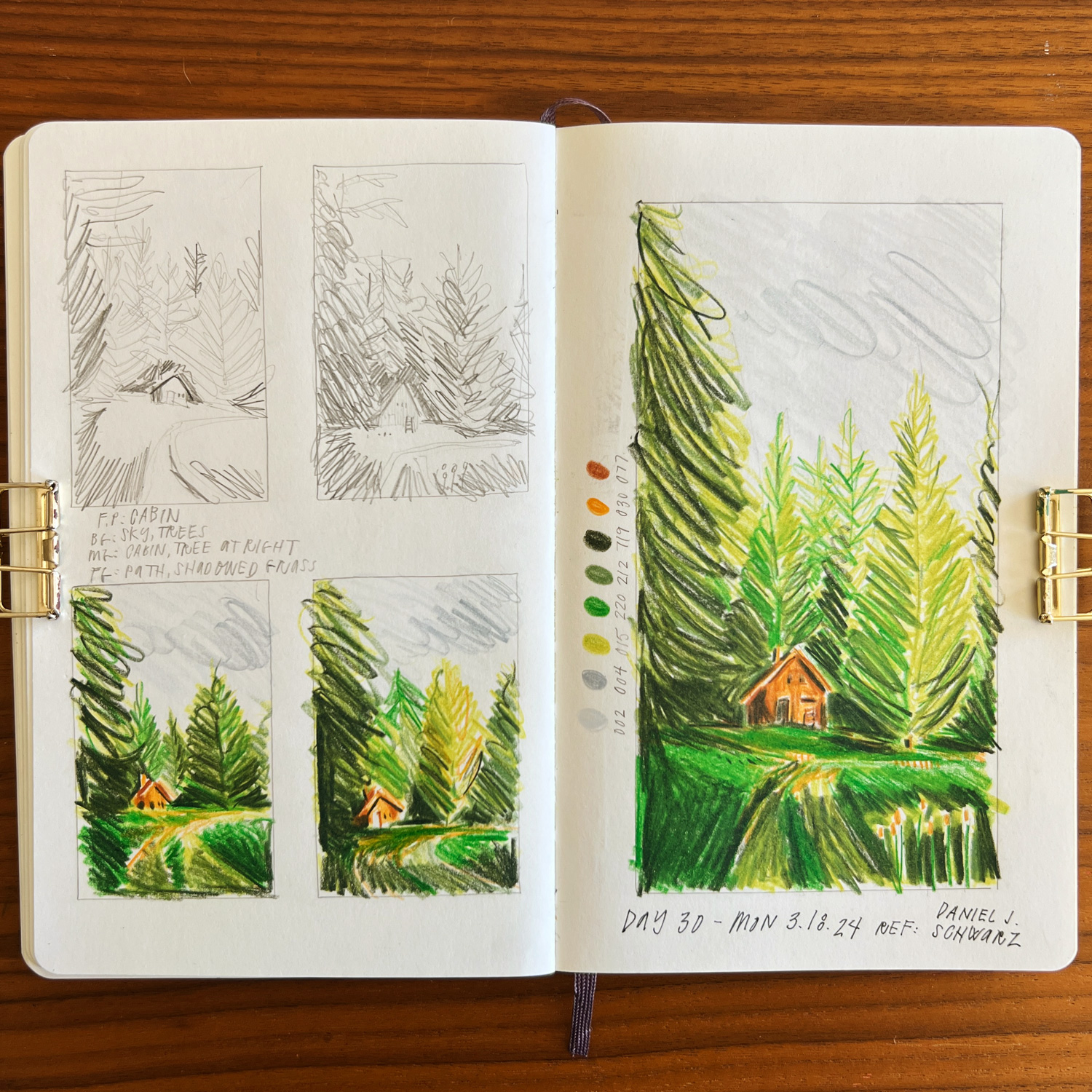
My takeaways from day 30 are:
- drawn from reference by Daniel J Schwarz
- it’s my first time using 220 (bright green color) in this landscape project. I grabbed it instinctively to capture the highlighted area of the lawn, but my brain was worried it would make the overall piece too childish. I’m really happy with the outcome and am glad I followed my instincts. I love that the greens are glowing, which is how they feel on grey days, but I do want to try and capture the moodiness better if I try again (mostly through darkening the trees more, leaving a few reserved pops of the bright chartreuse) .
Day 31: Tuesday, March 19, 2024: cabin on the lake
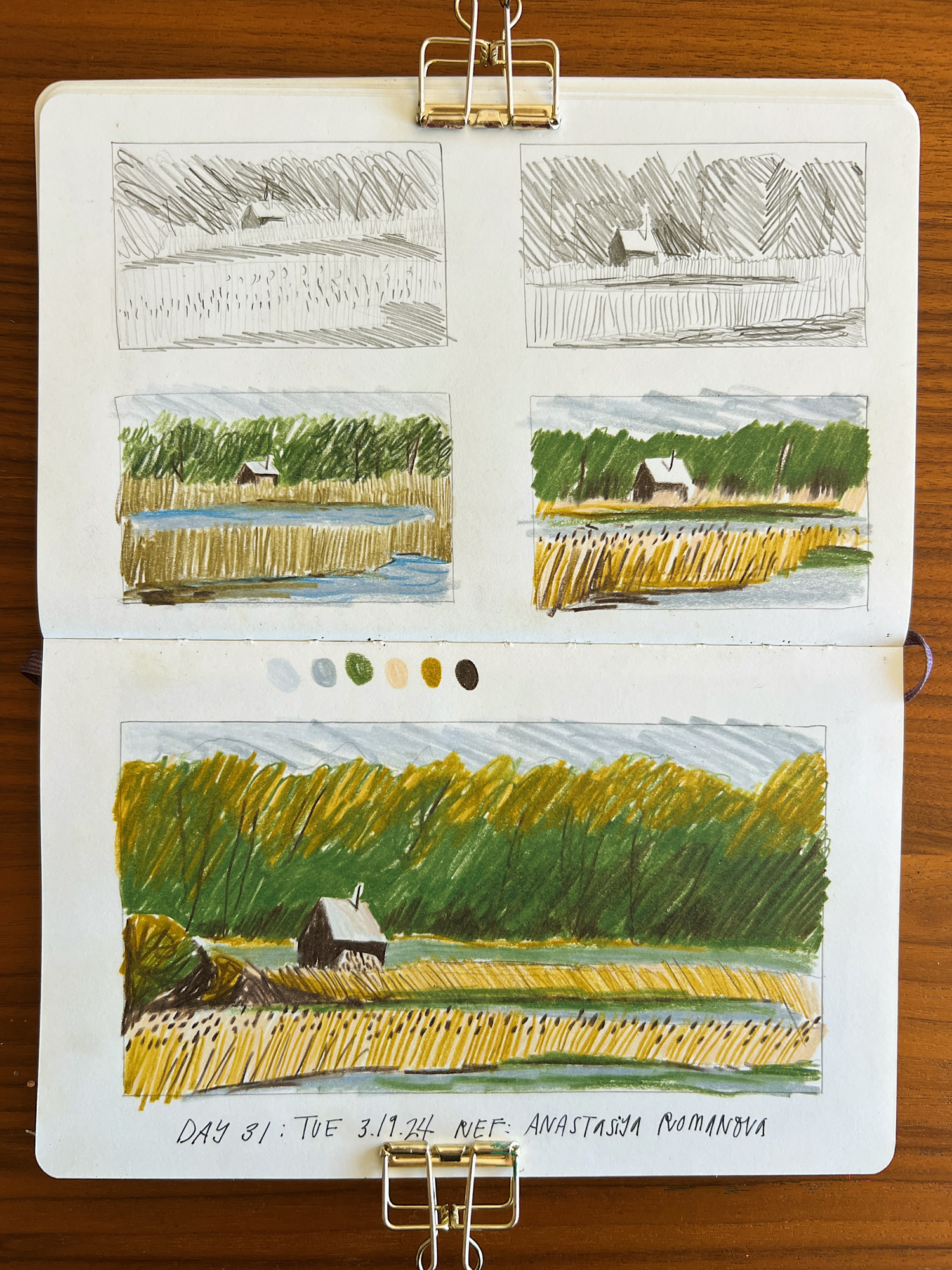
My takeaways from day 31 are:
- drawn from reference by Anastasiya Romanova
- in the thumbnails, the fields and grasses are drawn in the same direction. For some reason in the larger version I switched up the direction, and I think it breaks the illusion a bit.
- the little chimney pipe and thin shadow do a lot to add dimension to an otherwise flat and contrasted cabin.
- the chunks of water got drawn differently in the big piece, but I didn’t mind improvising with where to put water and land – I wasn’t fazed at all when I realized the chunks didn’t link up with the thumbnails, which signals progress.
- personally I’m dealing with a lot of stress around our upcoming cross-country move. So much to do and the timing is all so finicky. I realize I haven’t been drawing from my real life lately, but that’s because it has felt better to use my art time to escape to beautiful and tranquil places, free of people.
Day 32: Wednesday, March 20, 2024: looking down into the garden
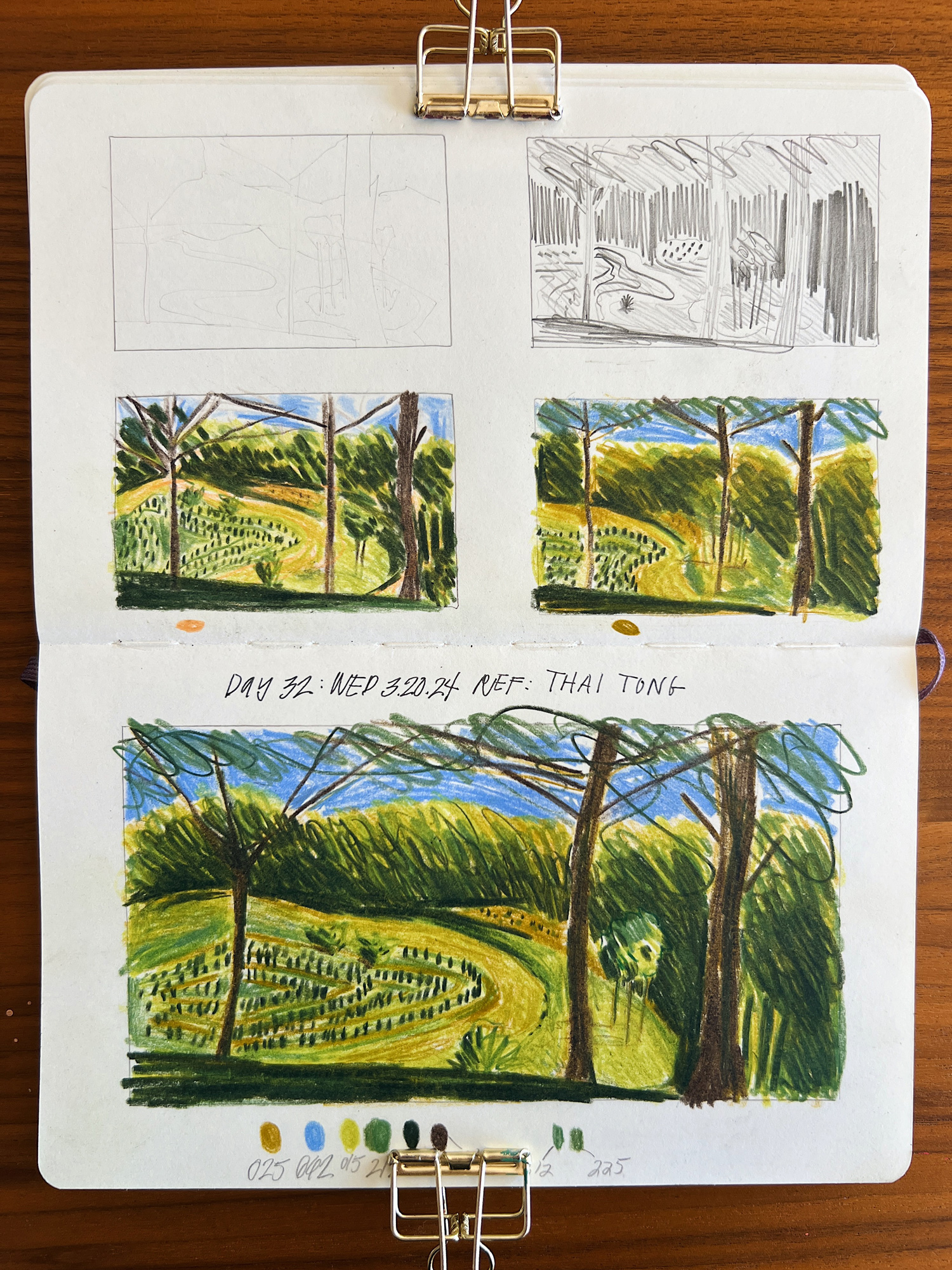
My takeaways from day 32 are:
- drawn from reference by Thai Tong
- My thinking: this reference is so complex! How fun, I think I’ll draw it. Oh wait, this is so complex, I don’t think I can. Maybe I’ll choose something easier. No, I’ll just give it a try.
- like anything it just needed to be broken down into a focal point, then foreground, middleground, and background, then the value study to make the picture click.
- it is tedious to have to work light to dark with the pencils, or to reserve light areas – this gets me excited to try some of these with gouache, as I won’t be beholden to working light to dark.
- I liked the first colored thumbnail and wanted to skip right to the large piece, but I pushed myself to try some sort of alternative with the second thumbnail, in this case testing a clementine orange underdrawing vs a golden ochre underdrawing. Surprisingly it was the second one I liked better and used in the larger version.
- I could’ve used my darkest pencil to create the sliver of foreground, but I build it up with gold and greens until adding the darkest on top – the layers really do make a difference
Day 33: Thursday, March 21, 2024: final daylight on the red cabin
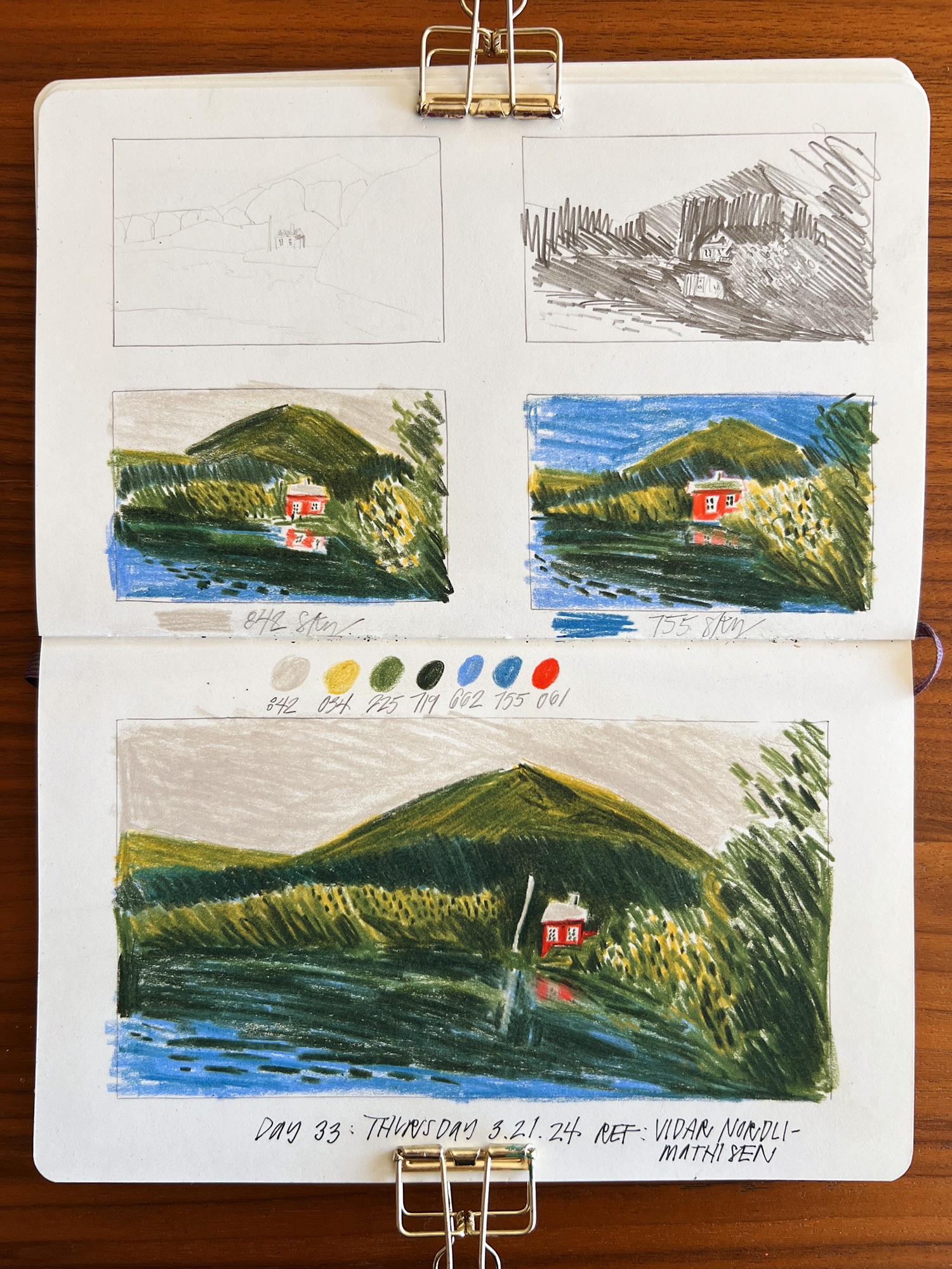
My takeaways from day 33 are:
- drawn from reference by Vidar Nordli-Mathisen
- I guess I just love a grey sky
- so pleased with the reflection of the cabin, but wish I would’ve drawn the reflection of the flagpole a little more wiggly; impressed that I even reserved the flag pole with all that dark water and foliage around it
- the cooler, dark green trees are underdrawn with blue, the lighter, warmer green mountains and trees are underdrawn with gold.
- coloring in mountains with different chunks of strokes moving in altering directions really gives the mountain form without drawing too much attention to it (see the first colored thumbnail, bottom right, or the mountain in the main piece)
Closing
I embarked on this project as a 100 day project, which was sooo unrealistic as my husband and I pack our lives up and move across the country. I’m ending it as a successful 30-ish day project! My why’s when I set out were:
- to confidently capture the magic and feeling of the places I love, for the rest of my life (This is a skill I’ve pined for and admire in others’ work)
- check! no matter the place, the process is:
- identify my focal point
- identify the foreground, middleground, and background
- do a quick value study
- render back to front, big to small, being mindful of the focal point and foreground elements
- check! no matter the place, the process is:
- to loosen up my shapes and be expressive in a subject matter in which I tend to tighten up
- check! timing in the earlier part of my challenge helped me find my scribble language
- to develop and strengthen my ability to:
- be expressive without making a mess
- check! this has to do more with me identifying the focal point, and working out a limited value study
- render people and places
- mostly check, still working on people at closer scale/with visible faces
- interpret and simplify detailed settings
- check! landscape details really helped with this; finding a language of marks for various elements in a picture. and also determining a clear focal point, which helps determine which things can be simplified
- be expressive without making a mess
So while I may have “failed” at my 100-day declaration, I succeeded at getting closer to my whys! And, the bigger life lesson for me here is to commit thoughtfully, which means checking my calendar, as my ADHD all too easily forgets things like “moving across the country.” And also to be in my own court when it’s time to wave the white flag or change directions. Ultimately no one cares but me anyway <3
See other 33 day project posts:
Week 1, Days 1-7
Week 2, Days 8-14
Week 3, Days 15-21
Week 4, Days 22-28
Week 5, Days 29-33


comments