

My 33 day challenge:
1 sketchbook spread of a place, scene, or landscape
- what:
- 4 x 1min speed sketches (left), 1 bigger 5min sketch (right)
- can use a reference photo (prefer to use my own life experiences, but random references are okay too)
- no Instagram, only telling art friends and sharing here
- why:
- To confidently capture the magic and feeling of the places I love, for the rest of my life (This is a skill I’ve pined for and admire in others’ work)
- To loosen up my shapes and be expressive in a subject matter in which I tend to tighten up
- To develop and strengthen my ability to
- be expressive without making a mess
- render people and places
- interpret and simplify detailed settings
Day 22: Sunday, March 10th, 2024: SKIPPED
- yesterday’s skip felt 100% passable, today’s was due to the resistance built up between my two “fails” from last week, and yesterday’s skip. I forgive myself but I do feel sad I didn’t show up.
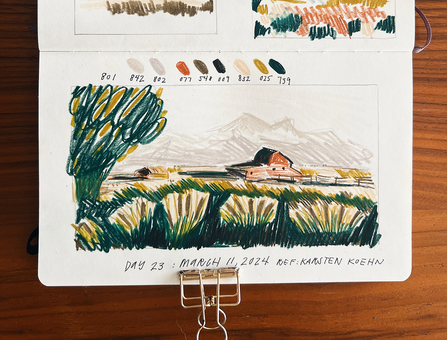
Day 23: Monday, March 11th, 2024: Back at the barn
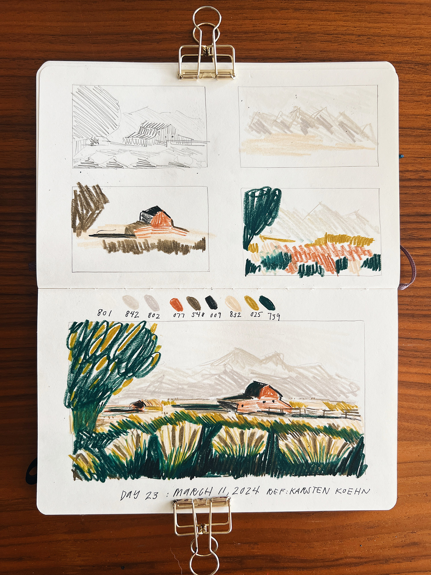
My takeaways from day 23 are:
- dear dylan of the future who will absolutely face resistance: the trick is baby steps. after skipping two days I felt a little stupid and scared at how to get started again:
- baby step 1: I got my sketchbook out and looked at the previous work I did. It at least got me curious at trying again
- baby step 2: using my templates to draw the frames on the spread. It changed my thoughts from “I wonder if I’ll draw today” to “I wonder what I’ll draw today”
- don’t forget to look at previous sketches before beginning; I tried to reinvent the wheel when there was already a lot of great info on my pencil sketches of this same picture from last week
- I avoided color overwhelm by picking 3 colors of different values for each the back, middle, and foreground.
- drawn from reference by Karsten Koehn on Unplash
Day 24: Tuesday, March 12th, 2024: barn with dark mountains
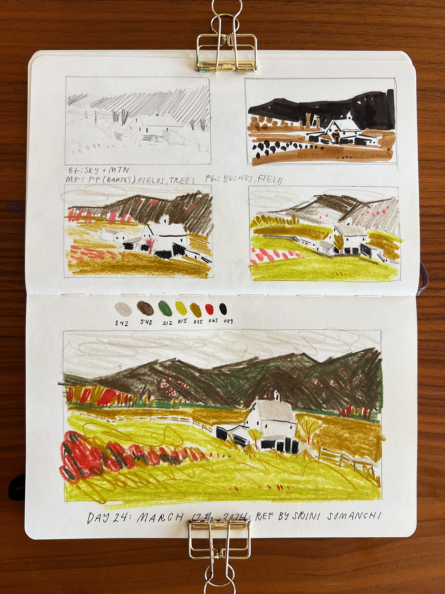
My takeaways from day 24 are:
- I love how the green mixes with the brown on the mountain. I couldn’t see it until I looked at the work the following morning in daylight.
- I created a simple fence by mostly using negative space
- I can’t remember what prompted the brown scribbles in the foreground grass, but I really enjoy the energy they bring
- I felt unsure about the yellow-green + red palette, but am pleased with the result; the green being pulled through the mountain really helps, I think.
- note on 3/16/24: looking back on this I love the colors so much. This is one of my faves and I remember feeling self conscious of the palette I was drawn too. Trust that gut.
Day 25: Wednesday, March 13th, 2024: Stevie in the flower bushes
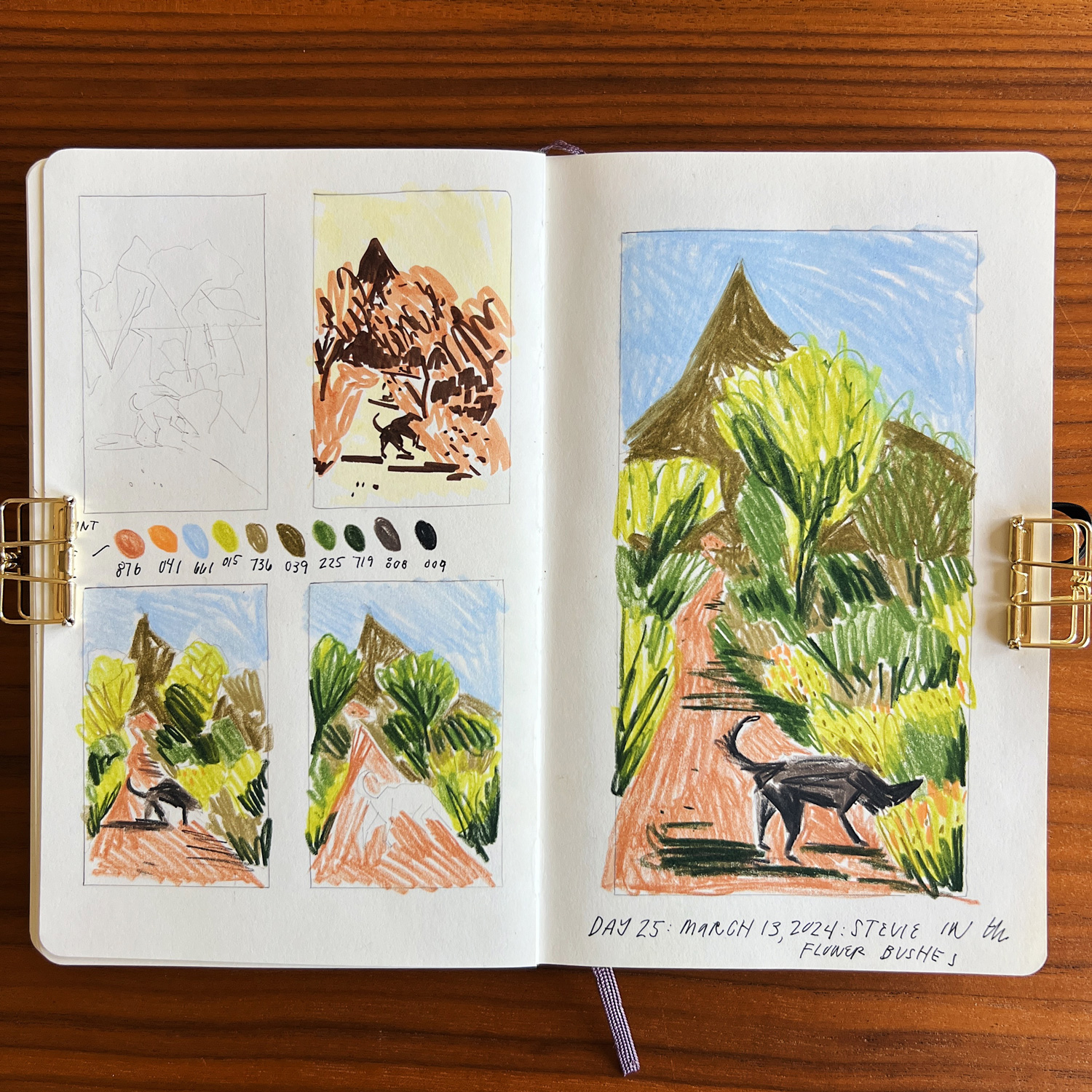
My takeaways from day 25 are:
- I drew this from two shotty reference pictures: one I took of the pathway, and one I took of Stevie with his face in some flowers. I’m proud of myself for compositing them together into a sketch and adjusting the landscape to make a better composition – I had zero idea how to do this before, leaving me heavily relying on perfect references (shallow pool), negating photos from my life.
- all the greens in the bushes and the harsh shadows are so pleasing
- stevie is a great focal point
Day 26: Thursday, March 14th, 2024: house on the hill
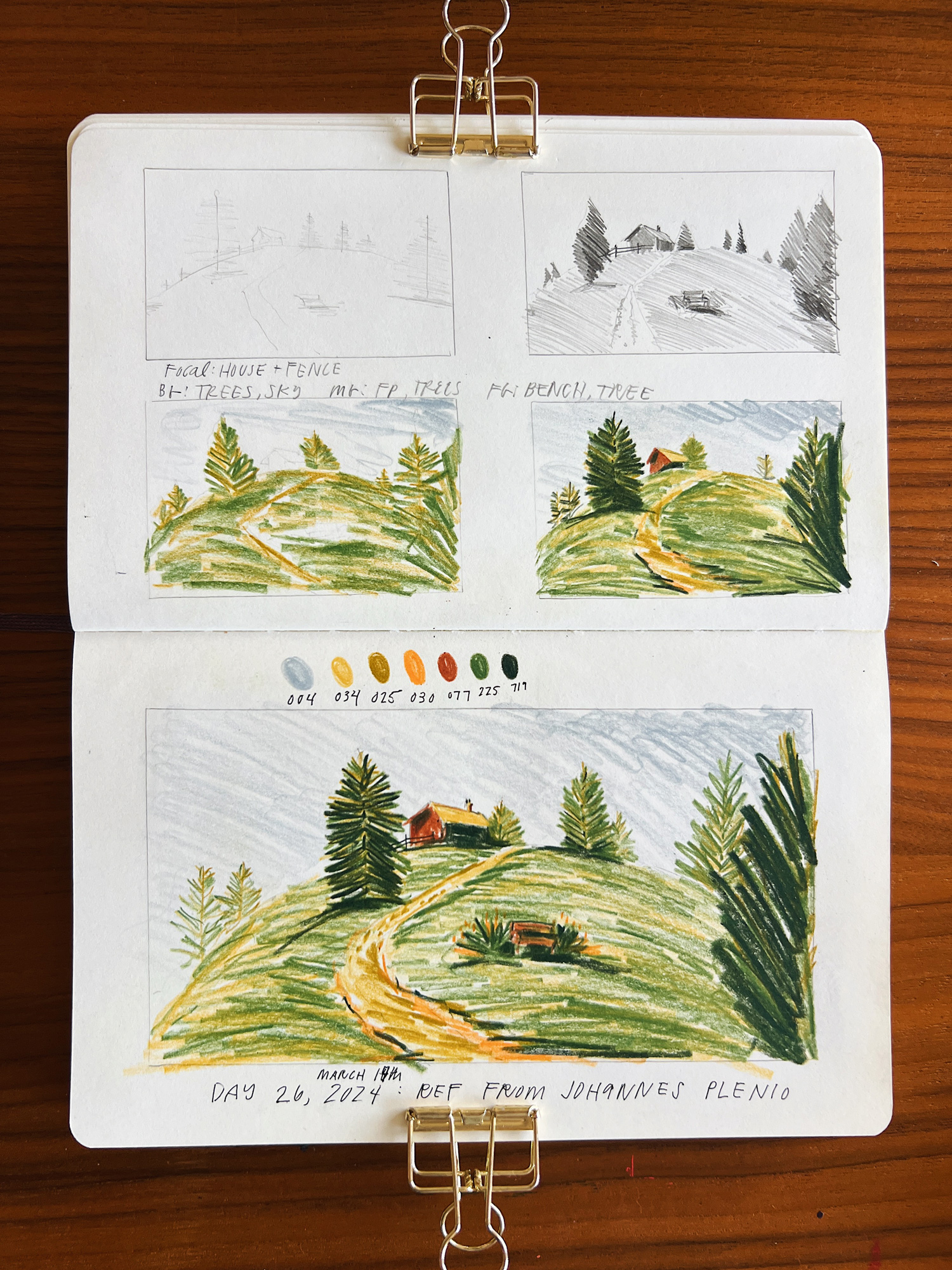
My takeaways from day 26 are:
- drawn from reference by Johannes Plenio
- the playful curve of the hill feels almost like a Wes Anderson film; it’s so charming. I’ll add this landscape idea to my toolbox.
- the layered grass is really nice
- the bench in the foreground is a little clumsy, maybe too big, maybe too dark
- it became easier to render the house when I looked at it as separate shapes of value instead of the shape I know in my head
Day 27: Friday, March 15th, 2024: the tree vs the barn in shadow
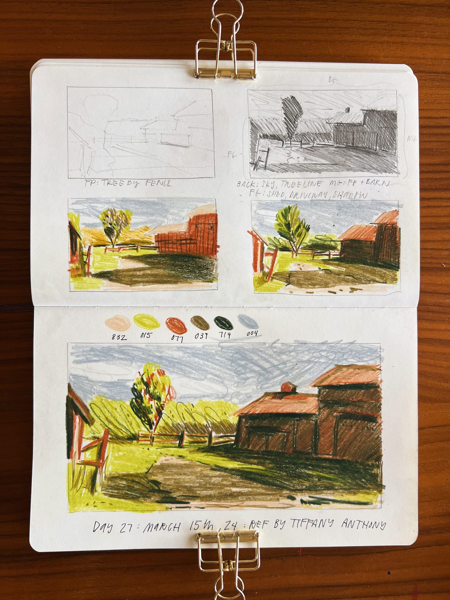
My takeaways from day 27 are:
- drawn from reference by Tiffany Anthony
- it took me a bit to discern what the focal point is: the barn is looming and heavy, but locked in with the dramatic shadow it casts. This led me to choose the tree just beyond the fence as the focal point, as it’s shining in the sun
- this was a great exercise in value, not sure I nailed it, but I’m proud of the results: my eye goes to the tree, is pulled over to the barn, along the shadow, stopped from going off the page by the fence and barn on the left, and led back to the focal point.
- love the darker grey-blue for the sky, as the illusion of light still comes through in the bright green of the trees and lawn.
- the thumbnails helped me simplify the overall palette, using the bright green for both the background tree line and middle + foreground lawn
Day 28: Saturday, March 16th, 2024: rocks with a view
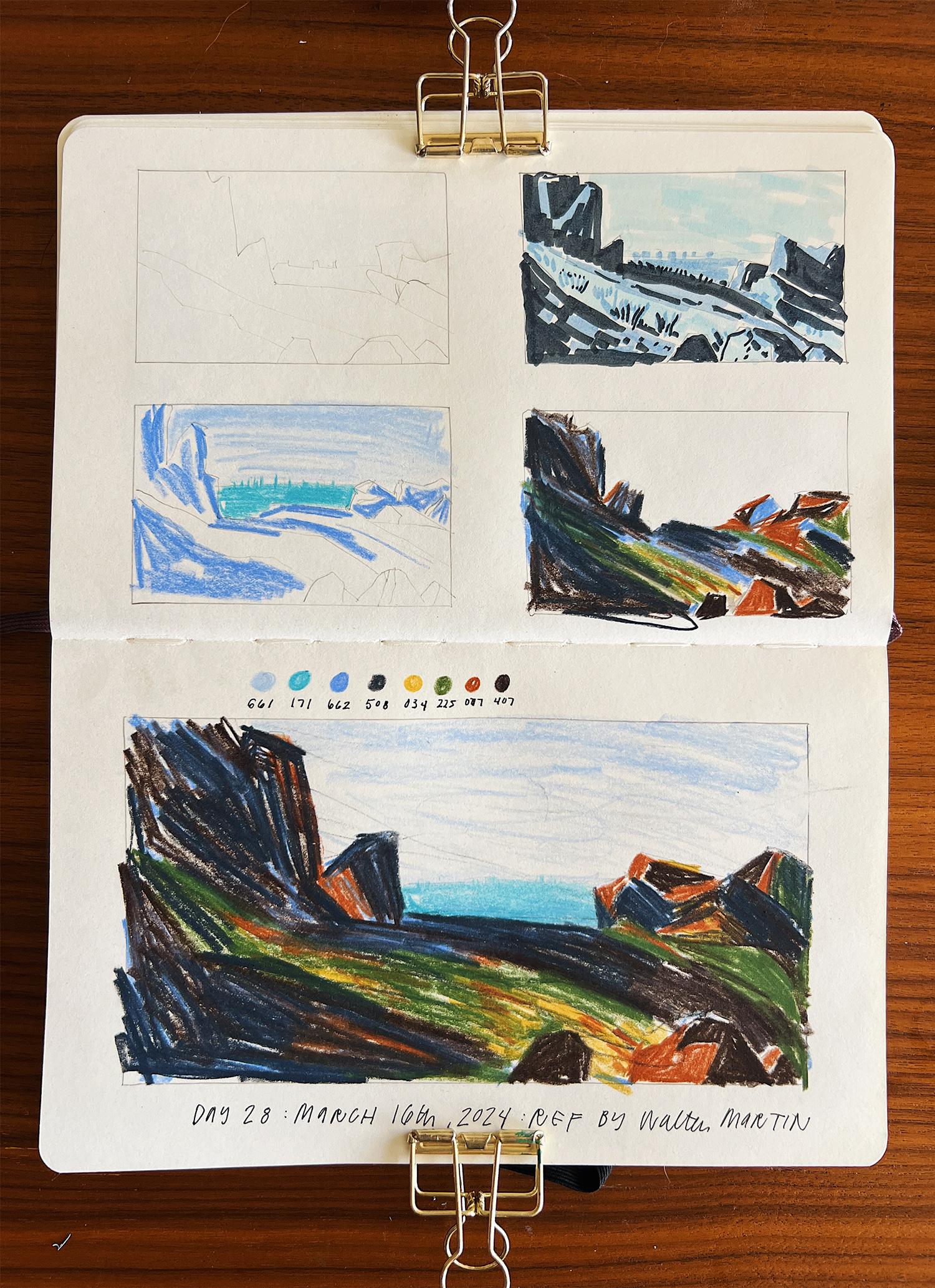
My takeaways from day 28 are:
- drawn from reference by Walter Martin
- the layered color, the blue underneath the rocks, and the deep blue and brown mixing together, is so delicious
- I went too dark on the green in the main piece, and can see in thumbnail four that a little variation of the green pressure helps the light illusion; luckily the gold color carried it’s weight in the main piece and still sparked some light on the rocks.
- the city (or body of water, choose your adventure) beyond the rocks was a little bolder than I wanted, and I made the mistake of adding dark scribble lines that ended up being too heavy, but this led to me learning something new: erasers actually can pick up some of the pigment, and in the case of the city beyond, it totally softened the color and texture and helped push it ‘back’ a little.
- my eyes are changing and I’m getting better at seeing what references/details will make a striking result, and it really is the value scale and light source. If there’s interesting light then anything can be rendered in an interesting way, if the light is flat the piece will be too. The reference for this photo is mostly rocks in shadow, yet they are the canvas for the pops of light on the rock faces, and a frame for the landscape beyond.
Closing
- when resistance calls, lower the bar, shrink the step
- create houses and structures from shapes of light, not the ‘known’ shape of the structure, this helps them blend in with their surroundings instead of feeling drawn on top
- pay close attention to roof angles, they make a big diff between amateur and ‘looks like it belongs’
- I never want to; I never regret it (this will baffle me until the end of time)
- landscapes seem to be a nice fit for getting to use all sorts of colors without creating an end result that feels garish or childish (not like when I try to do the same with flowers and then the whole things looks like a kindergarten nightmare)
See other 100 day project posts:
Week 1, Days 1-7
Week 2, Days 8-14
Week 3, Days 15-21
Week 4, Days 22-28
Week 5, Days 29-33


Love, love, LOVED all of your weeks of sketching. I liked the layout and have not considered this type for landscape sketches in the past. It’s going to be one I try for sure! I hope you’ll consider 100 Completed Days vs. 100 Consecutive Days….would really enjoy seeing you pick this up again after the move/unpacking, etc. is settling down.