

My 33 Day Challenge:
- 1 sketchbook spread of a place, scene, or landscape
- what:
- 4 x 1min speed sketches (left), 1 bigger 5min sketch (right)
- can use a reference photo (prefer to use my own life experiences, but random references are okay too)
- no Instagram, only telling art friends and sharing here
- why:
- To confidently capture the magic and feeling of the places I love, for the rest of my life (This is a skill I’ve pined for and admire in others’ work)
- To loosen up my shapes and be expressive in a subject matter in which I tend to tighten up
- To develop and strengthen my ability to
- be expressive without making a mess
- render people and places
- interpret and simplify detailed settings
- what:
Day 1: Sunday, February 18th, 2024: light-filled curtains in the living room
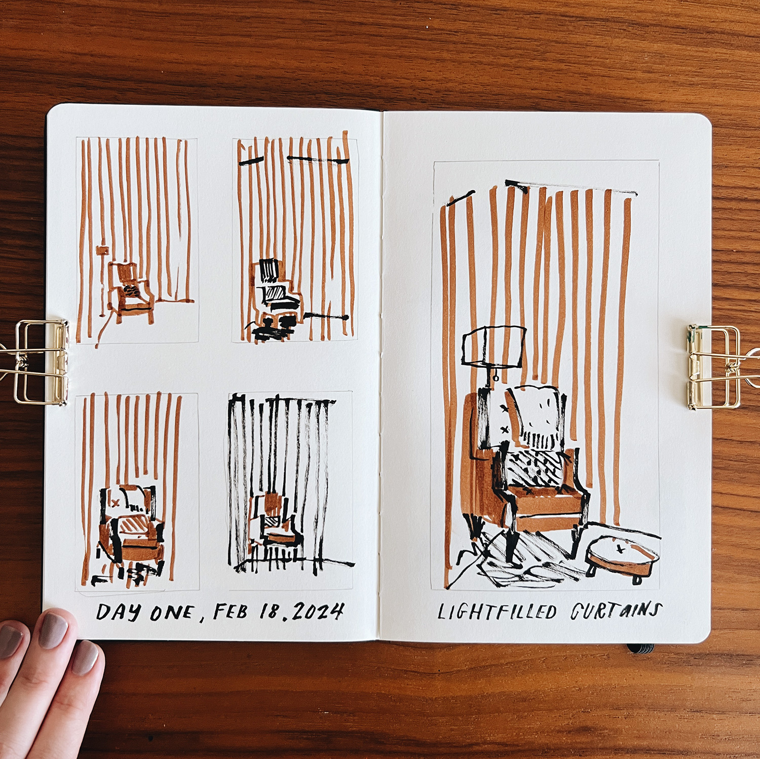
My takeaways from day one are:
- it doesn’t matter how cute the plan is, when the time comes I should still expect resistance, and do the thing anyway 🙂
- a timed challenge really forced me to focus and make decisions
- four thumbnails pushed me to think of other approaches
- I actually really love the final result. I would’ve gotten lost in all the details if I had more time. Instead I simply captured my favorite reading chair in its sunny spot by the tall curtains.
- Drawn from my own reference (below)
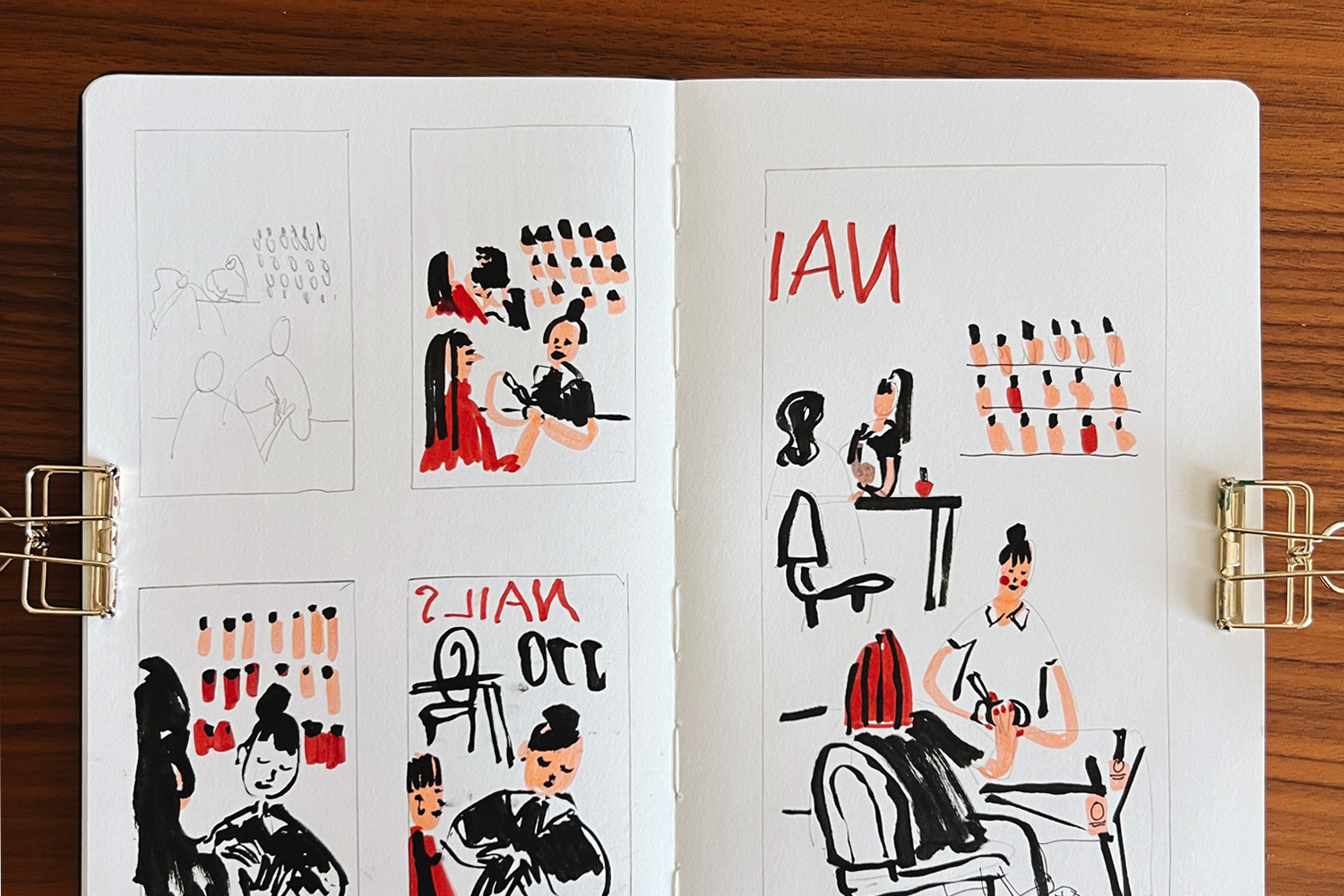
Day 2: Monday, February 19th, 2024: Nancy at the nail salon
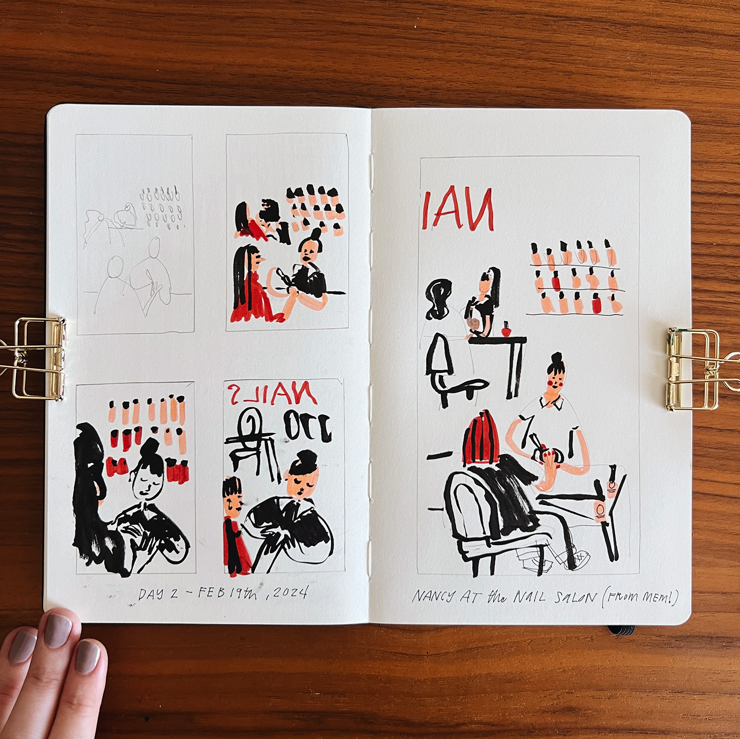
My takeaways from day two are:
- when I got to my table I felt sooo bored by all the reference images I had on hand. What I really wanted to capture was the nail salon I go to, as I always feel welcome and special there. I felt very nervous to take it on because it contained people and a lot of elements in the room. The point of this challenge is to be able to capture my real life, so I pushed myself to try the nail salon anyway, even without a reference image!
- not having a reference allowed me to not be tied to the actual layout of the real nail salon, which has nail techs working in a long row in the center of the room, and instead I could focus on capturing what I know of the nail salon: Nancy, polite and focused, the bright and cute bottles of polish on the wall, the neon sign in the window, and the open-airy feel.
- I like when multiple colors and negative space are combined to create form, like Nancy in her white polo with her long arms and dark, black hair.
- 5 minutes on the big sketch isn’t quite enough time to fully render or realize the piece, but it is a nice step up from the 1 minute sketch. I could see going from a couple 1 min thumbnails to a full blown piece would still be tricky, as there are more details to explore on the bigger piece. Maybe as I get better I can spend 10 or 15 minutes on the bigger piece.
Day 3: Tuesday, February 20th, 2024: Lunch w/ Jen in Scottsdale
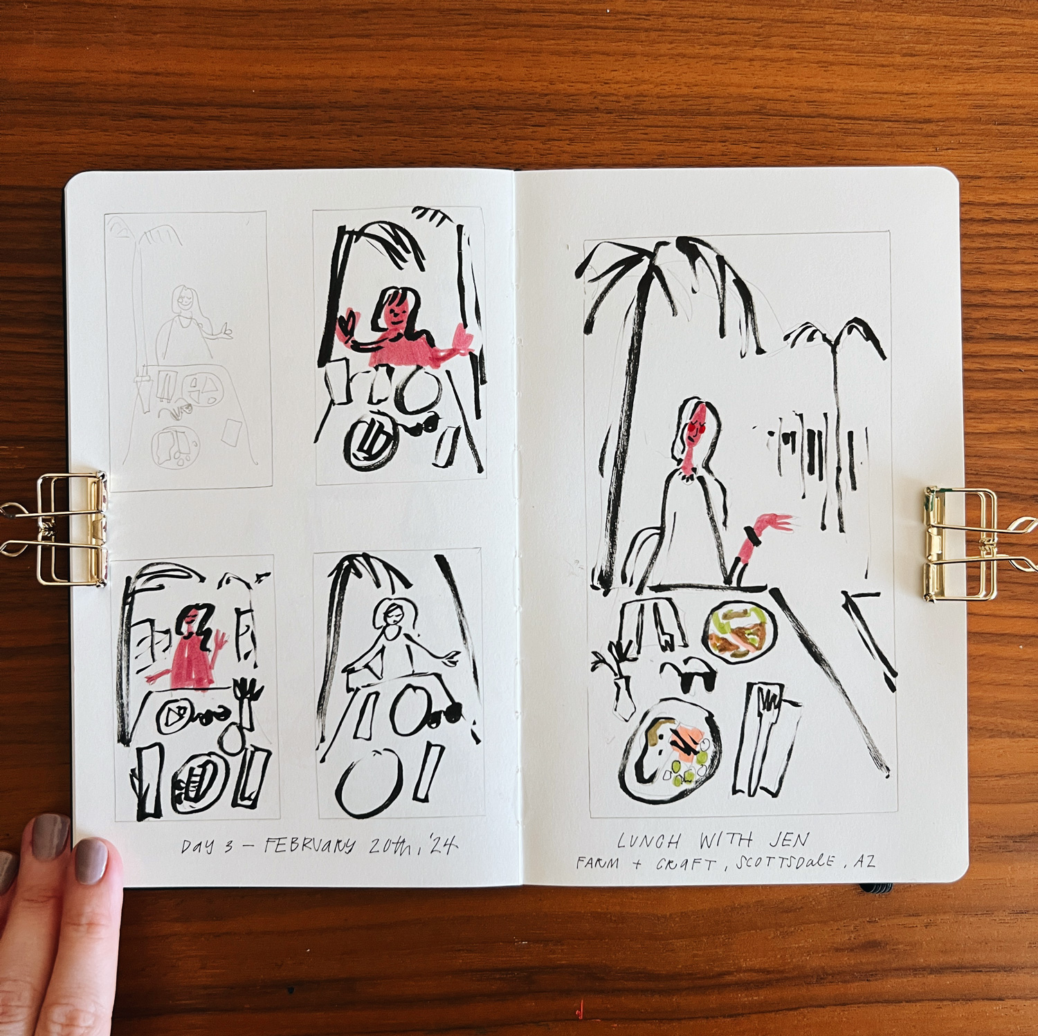
My takeaways from day three are:
- when I push myself to draw the ‘hard’ scenes from my life I feel very satisfied and happy afterwards that I captured it
- so far it looks like this challenge is helping me a great deal with simplifying the scene and editing it to my liking. there were many other details around Jen, the bright blue sky, the cars stopping at the stop sign behind her, birds flying around, but the story, the memory, was listening to Jen talk about her dreams if she were one day independently wealthy, while we ate delicious, fresh lunch.
- I like the nod to perspective that the two palm trees create, as well as the shops receding into the background that point to Jen’s face
- dear brain, it’s actually okay if the people and places don’t look factually like the people and places – it captures them for me, and that’s enough
- I’m still worrying/fearing “I’m not doing enough, these aren’t full enough, these aren’t finished”, but for now I’m just trying to notice those feelings and thoughts without changing or solving them. Maybe these aren’t full enough, aren’t finished – I’d still be sad if these pages didn’t exist, and that’s what’s meaningful to me.
- Using color is helpful for immediately calling out the subject matter, while the outlines offer a secondary level of detail, or a step down from the color bits. I hope as I move through the challenge I can find ways to keep this balance while working in more color areas.
Day 4: Wednesday, February 21st, 2024: A rainbow for Brooksie’s birthday
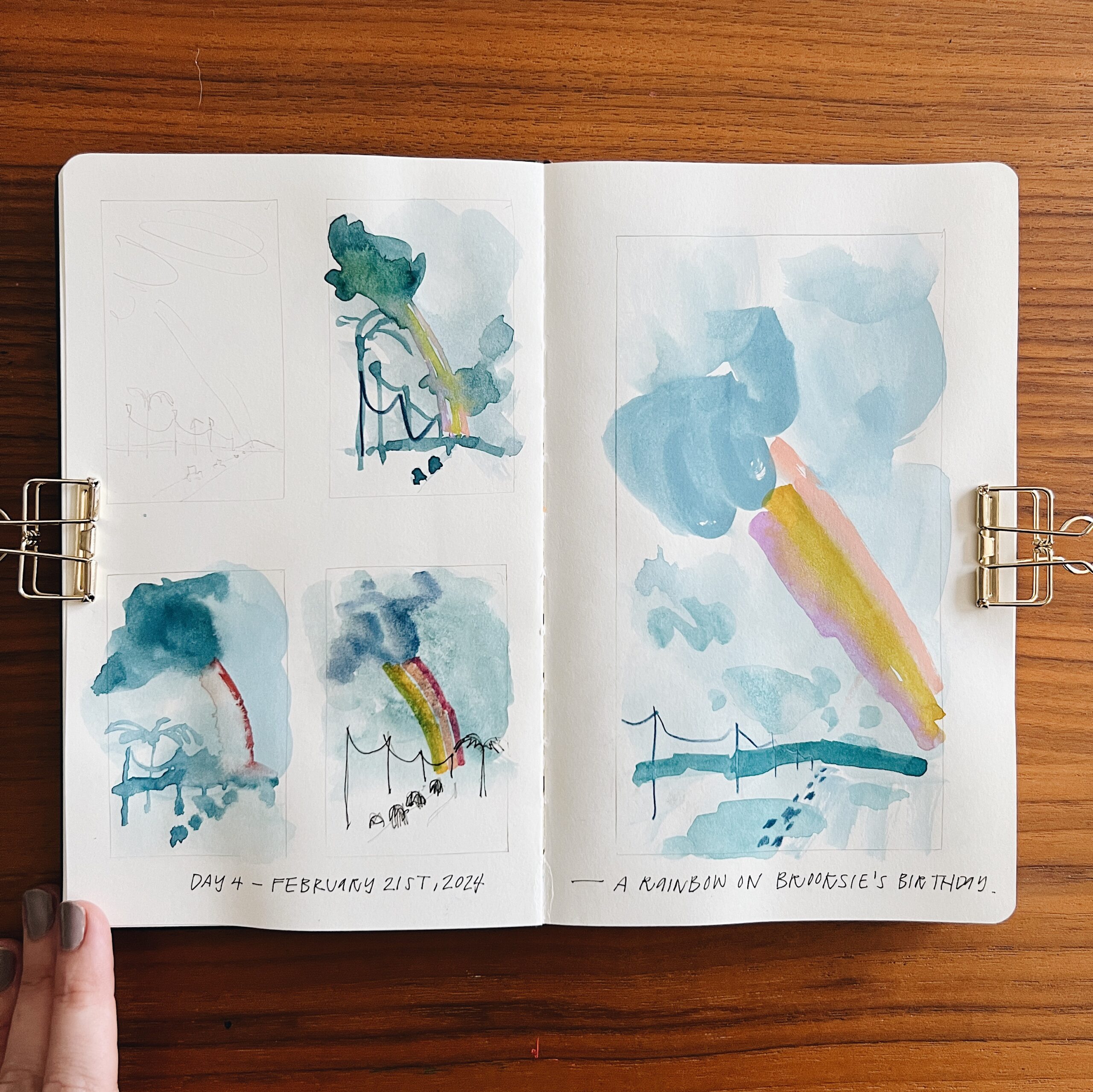
My takeaways from day four are:
- even a rough reference photo is enough of a starting point, I can edit the frame to be how I like. This is something I’ve struggled with for a long time, the need to rely on a perfect reference or else being left unsure what to draw.
- paint is great for fast full color, but not conducive to timed thumbnails
- thumbnails were very frustrating and felt like they were going nowhere, yet they still helped lead me to a stronger final result
- the scale of shrinking the cars down to tiny marks really clicked something in place; I like exaggerated contrast of scale, when something very large makes something else tiny, and vice versa
- leave things be!! the next morning I couldn’t help but try to add in a few smaller clouds and cloud shadows, but it sort of broke the effect between the big rainbow, thin power lines, and tiny cars
- using a big enough brush for the sky (size 10 or 12 round) made a big difference on getting the marks right (until I added those stupid tedious clouds the next morning)
Day 5: Thursday, February 22nd, 2024: A barn in the garden
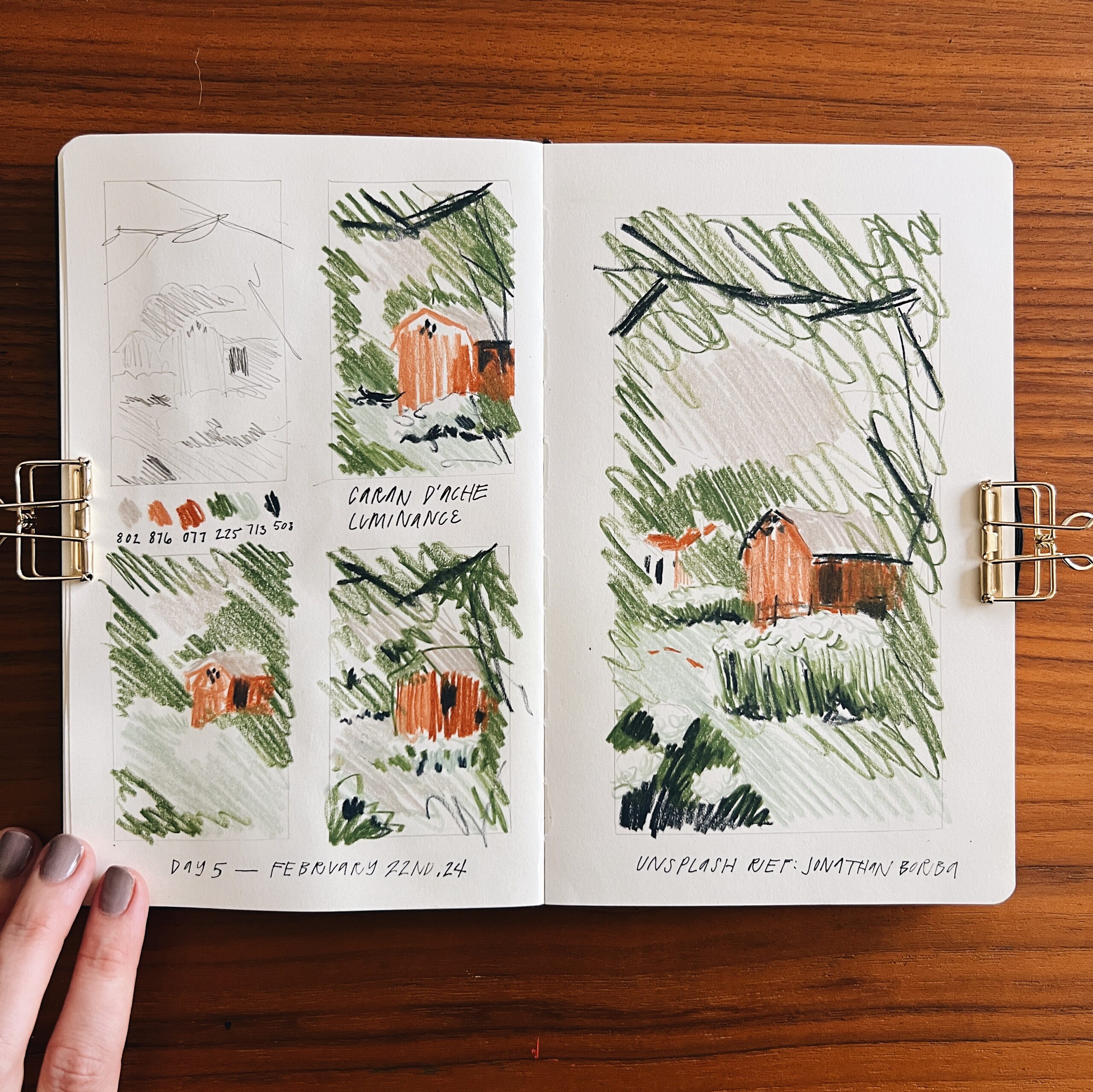
My takeaways from day five are:
- drawn from a reference photo by Jonathan Borba on Unsplash
- colored pencils are much more conducive to quick timed sketches that are full color
- love the scribbly-ness, and that the color palette is sort of natural and simple
- when I sit down it’s been incredibly helpful to ask myself:
- what’s the focal point? (the barn)
- what’s the foreground? (flower bush in bottom left corner, tree branches framing top right corner)
- what’s the middleground? (the lawn, flower bushes, and barn)
- what’s the background (house, trees, sky)
- then I decide my colors and materials, and hit go on the timer
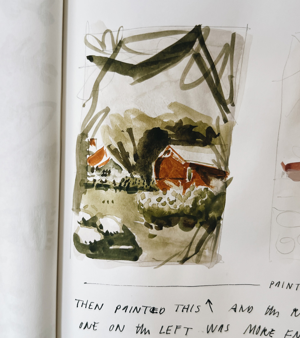
- yesterday after the barn sketches I painted the same scene with gouache and it came together very quickly while using this same method! eeee! (focal point, grounds, materials, back to front)
- in the barn drawings the dark window was drawn on top of the solid wall, but in the painting an opening was left for the window, and the painted in window left a little shred of negative space, which IMO helped better frame the window and make it less heavy than in the drawing
Day 6: Friday, February 23rd: Family walk with Brooksie and Stevie
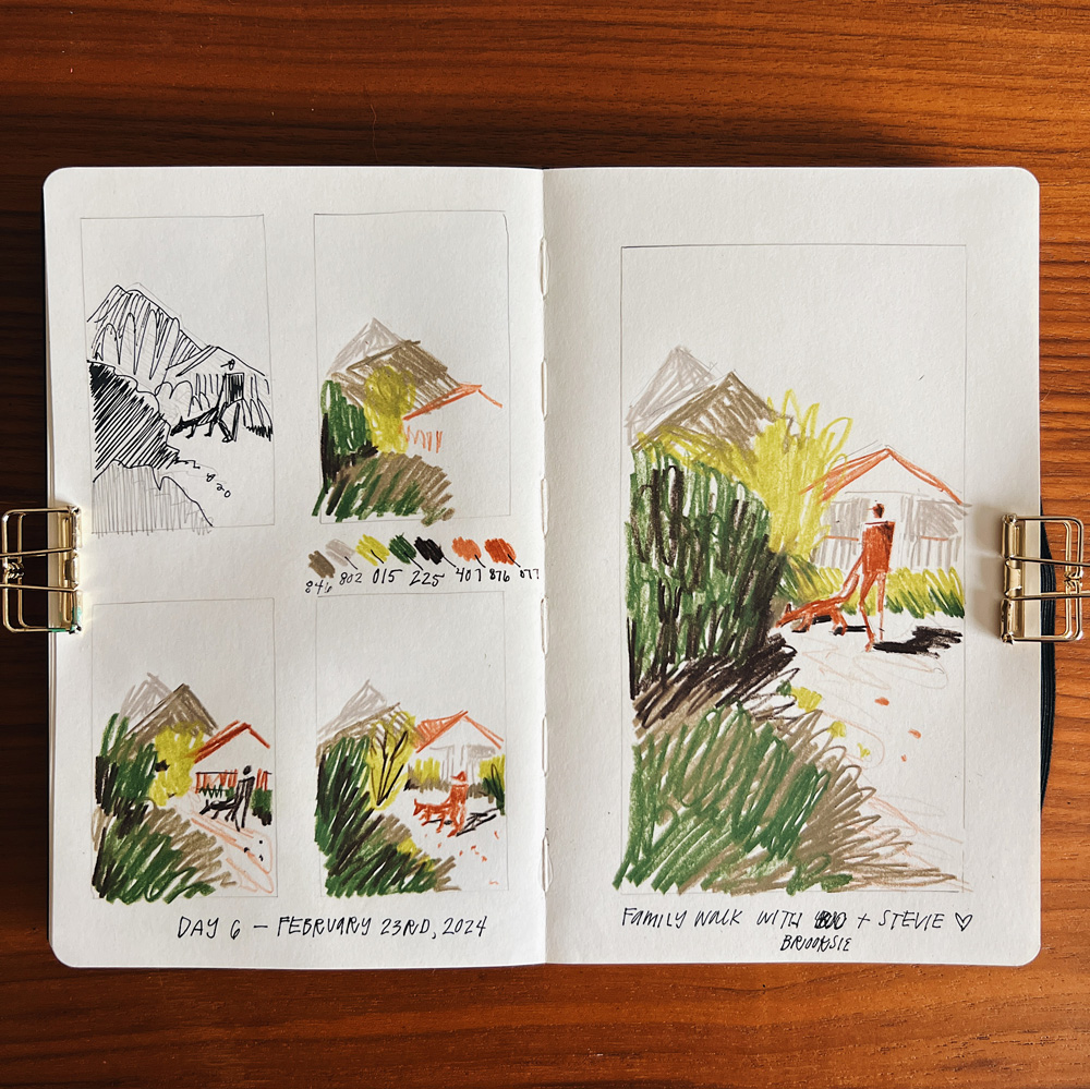
My takeaways from day six are:
- I’m so happy to have this scene in my sketchbook; I know the exact part of our regular walk that it’s from
- working back to front (general to specific, big to small) while minding the focal point really helps me render the image
- I already feel sooo much more confident than I did, though I want to continue incorporating people.
- I was able to snap a reference that captured a nice composition, which left me with less to think about when it came time to draw
Day 7: Saturday, February 24th: Family car ride
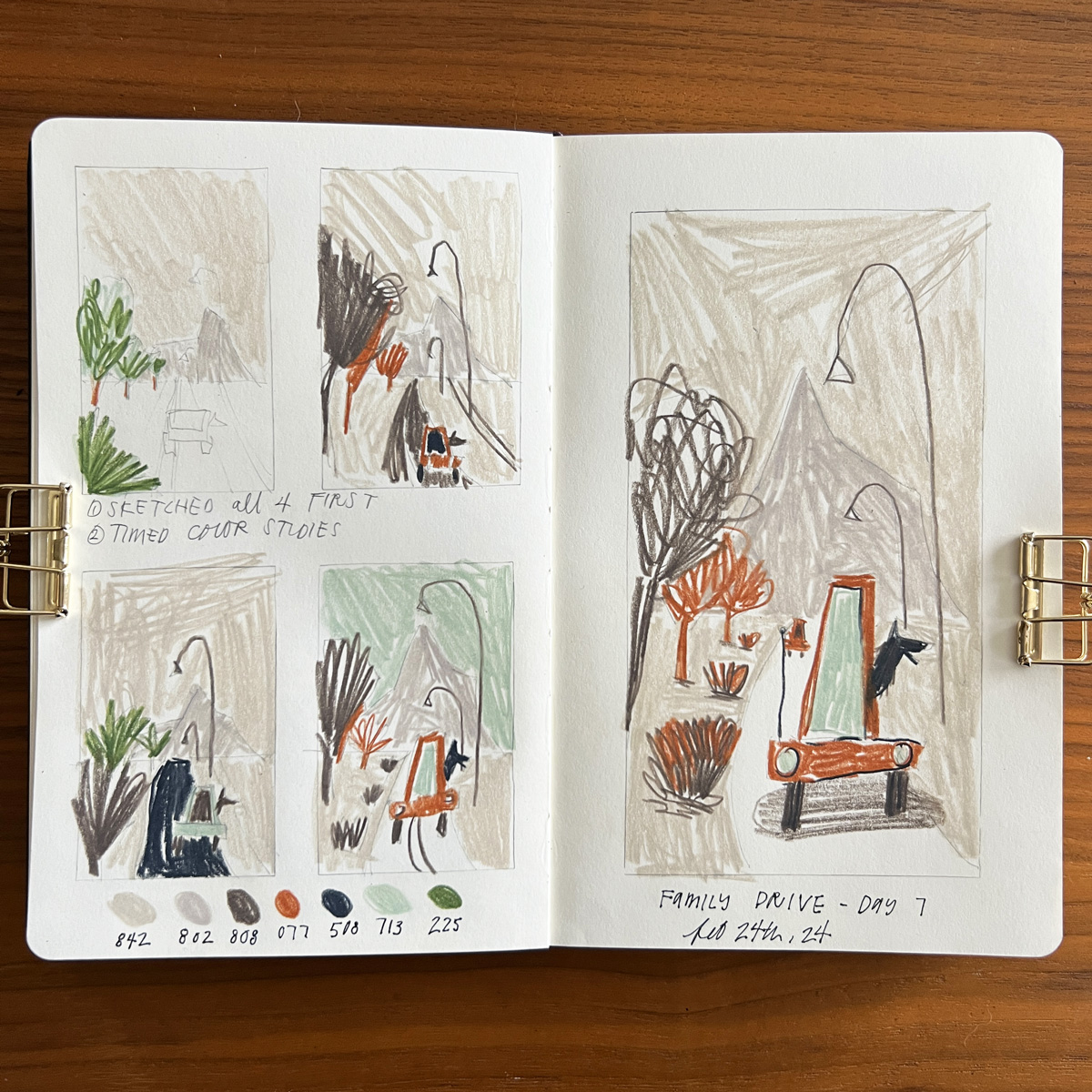
My takeaways from day 7 are:
- I ate a pint of ice cream and went to bed with a stomachache at 6:30. Woke up at 1:30am, brushed my teeth, washed my face, and got my challenge done 🙂
- wish I would’ve thought to add a little license plate to the car to help show it’s driving away! I could still do it in a painted version
- It feels very freeing to not be tied to the colors as they were; instead using grey skies helps create a world that I like more, even though the sky was bright blue and the trees bright green. This is an area I struggled with before, so it’s an exciting personal breakthrough
- not only am I not using the colors as they were, but I totally concocted this composition. I had taken a shitty reference photo just to capture some of the details (like the light poles), but it didn’t fully inform the composition.
- I’m noticing that I really love using earthy, neutral tones much more than bright colors (or using the bright color as a pop of nature, as in the previous day’s green trees and bushes, which I quite like as it’s balanced with the neutrals in the piece)
- a little bit of negative space goes a long way to not make the illustration feel too blocked in, as with the street in this drawing – it provides relief that I really like, and I notice I like it in other’s work too.
Closing
Not all weeks will feel this successful, but I’m grateful to be finding some of it during the first week. I’m already closer to some of my why’s, and look forward to the growth ahead of me.
See other 33 day project posts:
Week 1, Days 1-7
Week 2, Days 8-14
Week 3, Days 15-21
Week 4, Days 22-28
Week 5, Days 29-33


Wow, thank you for that travel in your creative week.
So inspiring, so informatives, tips, that’s a method i would definitly try. Thanks !!
I really love the results, so alive, colour are really nice. (sorrry, i’m french speaker and don’t have enough vocabulary to express how i liked it ahha)
Thanks for the newsletter too, feels so good to read about these moment when we don’t like nothing anymore, from our art to our clothing, made me laugh.
(and feel less alone hihi)
Your comment is beautiful, Orbie!! I’m glad you feel less alone as an artist (hihi)
Dylan, these are wonderful! I really like your approach to this style. Loose sketches have always been a challenge for me, but I always admire artists who can pull it off. I’m very excited to watch where this 100 days takes you! Thank you for always generously sharing ❤️
Thank you thank you thank you!! It feels so exciting to make some progress on this goal. Thank you for the encouragement, Kelli! <3
Hi DM. Thanks for sharing. I really liked how you did 4 sketches first – on the left side. And then a bigger, more-finished version on the right. A great way to create a spread. Gonna try that. And love that your glass is half-full: 33 Day Challenge!
Good luck with your move.
xxMichelle
Thank you Michelle! Definitely try the layout! It made the larger, main piece feel more relaxed and enjoyable because the big decisions had already been made. <3
Such a wonderful share. Your notes about the progress made each day is not only interesting to read but super helpful to apply to my own work which often feels belabored to me. Working fast like this feels scary to me, which means it would probably help me a lot to try this myself.
Oh I love your work so so much, Lori! Working fast felt scary to me at first too, but as you can see was really helpful. Let me know if you end up trying it!